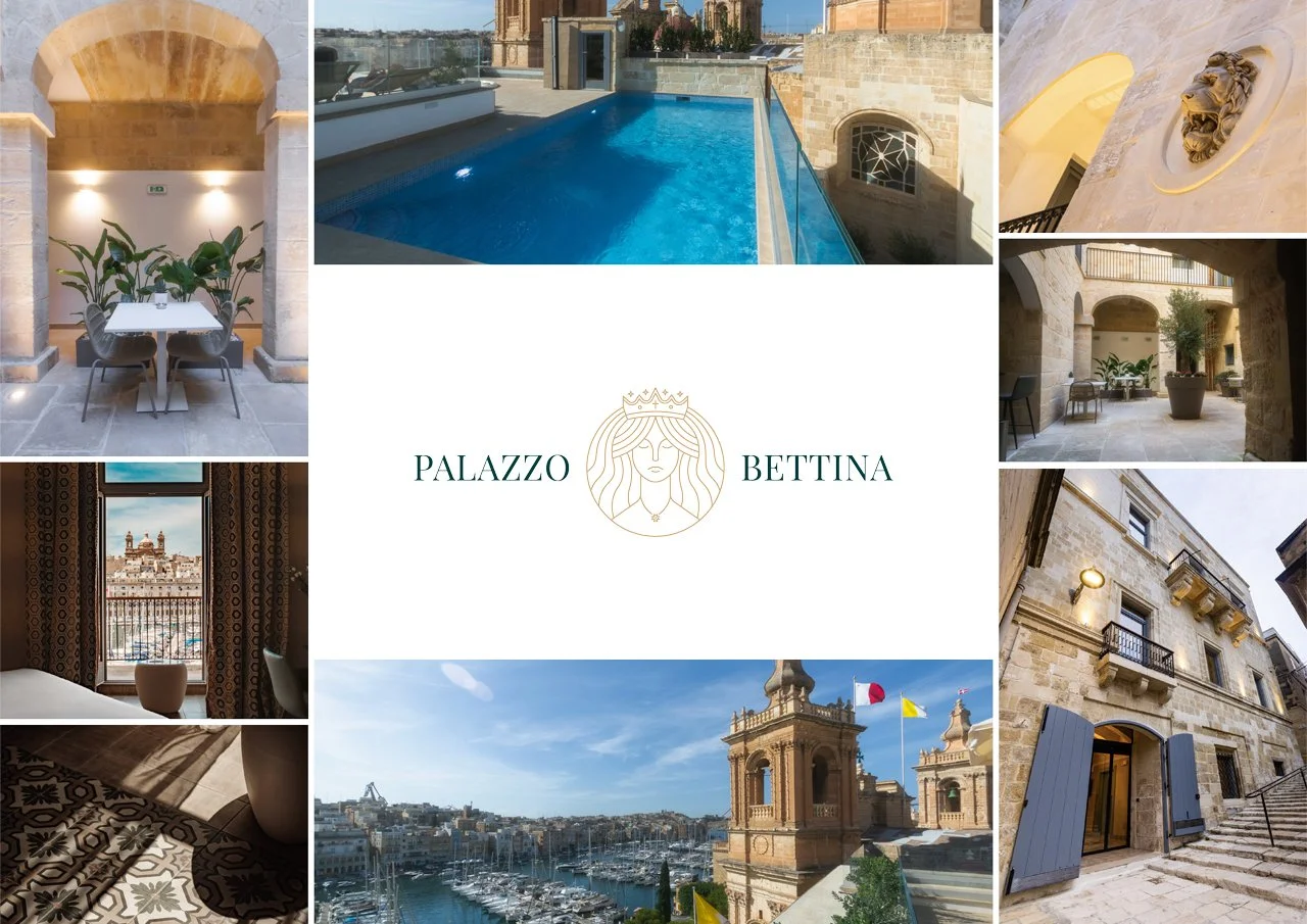
The Palazzo Bettina
The IBB Hotel Palazzo Bettina Malta is located in Birgu, also referred to as Vittoriosa, and is the oldest of a part of Malta referred to as the three cities, which also consist of Senglea and Cospicua. These are three fortified towns built in very close proximity to each other around the Grand Harbour and are steeped in history.
The concept.
To create a new logo for the Palazzo Bettina Hotel, one that embraces the diverse and magical history of the property.
Dating back to the 17th century, the Palazzo Bettina is steeped in history, serving as a residence for several distinguished individuals and families. In particular, Elizabeth Muscat Dorell (1741-1829), known as Lady Bettina, who gave her name to the building.
Lady Bettina was a court lady of the Queen of the Kingdom and a benefactress of the St. Lawrence church, the building alongside the Palazzo. She was also famous as being the aunt of Fabrizio Sceberras Testaferrata, one of the most famous Maltese Cardinals.
The palazzo served as a British military hospital in the second half of the 19th century.
St Ġorġ Preca, a Maltese Catholic priest and the founder of the Society of Christian Doctrine as well as a Third Order Carmelite also made use of the property as one of the seats for the Society of Christian Doctrine in the inter war years. The property was split into tenements just before World War II and was somewhat damaged during the war, following which it remained disused for a long period.
My approach.
With a history as good as that, the logo just had to incorporate it all. I felt the best way to portray this heritage was with a classic and timeless emblem logo.
Establishing keywords from the persona of the hotel helps to realise the vision. The logo design should reflect these characteristics to the audience and establish the identity of the brand.
An emblem logo allows me to add each key element into a singular design, encompassing everything that the Palazzo Bettina is about.
The product.
I arrived at the idea of using a portrait of ‘Lady Bettina’ and incorporating all the unique aspects of the brand alongside.
The design features 4 stars to symbolise the rating of the hotel
A Catholic cross to pay homage to it’s Catholic roots
The cross can also be seen as sword, to show the hotel’s military connections
Lady Bettina to portray the building’s name and most influential resident
Ocean waves to symbolise the hotel’s location in the marina
The Maltese cross for a sense of patriotism
And finally the crown, to show Lady Bettina’s royalty connections
Package:
The Starter Package
Completed:
2023
The colours.
To give the audience an authentic feel of the building and it’s location, the colour palette was picked from an image of the hotel.
This approach gave a brilliant and luxurious colour palette that was really in keeping with the brand and their target market.
The end result.
A fantastically well rounded logo design which suits the brand down to the ground.
This is a classy and unique visual identity that will stand the test of the time and serve the Palazzo Bettina for all of it’s years to come.
“We are absolutely thrilled with this new logo, Felix really hit the mark with our brief and we can’t wait to roll this new identity out.”
Palazzo Bettina


