Completed:
2024
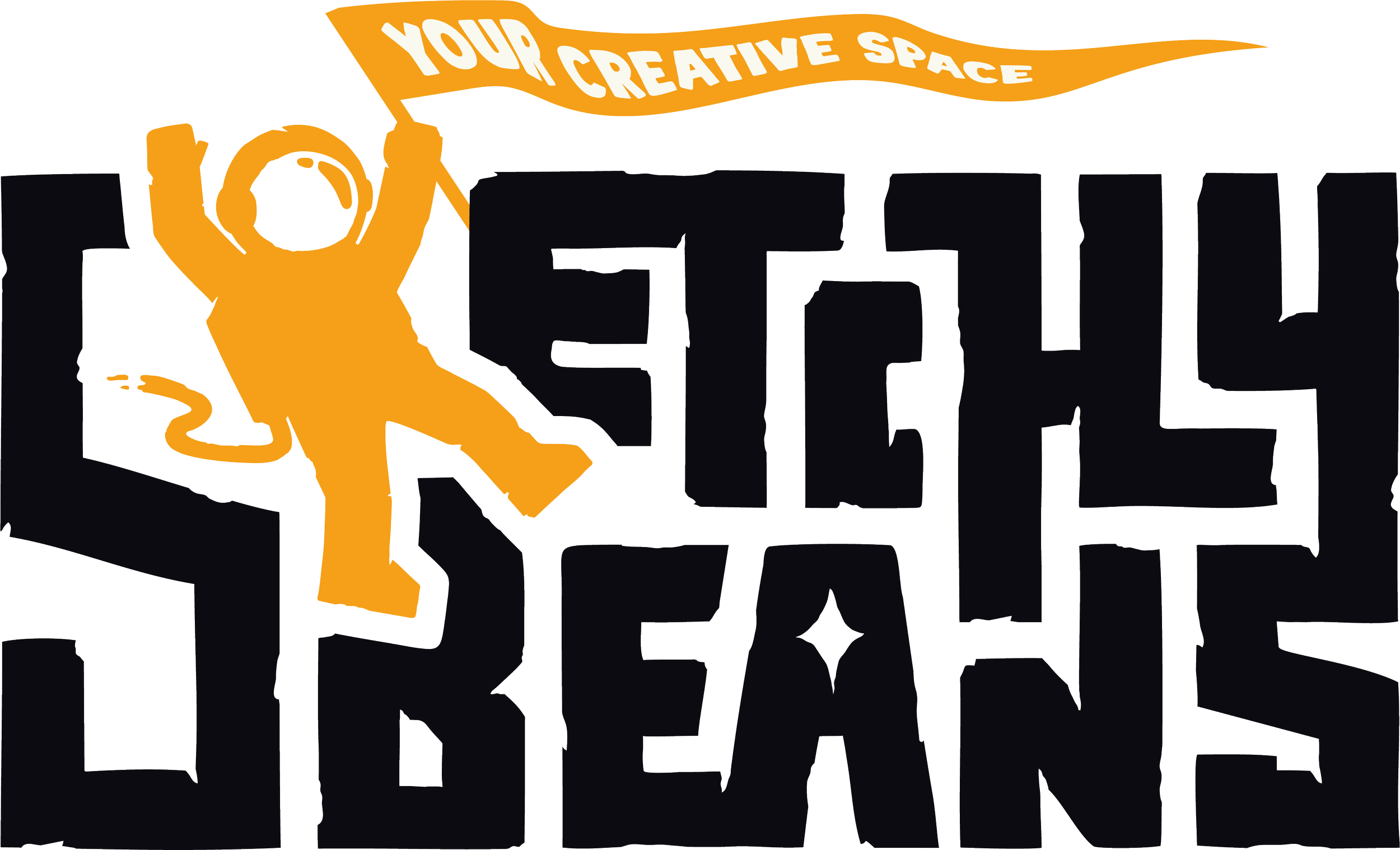
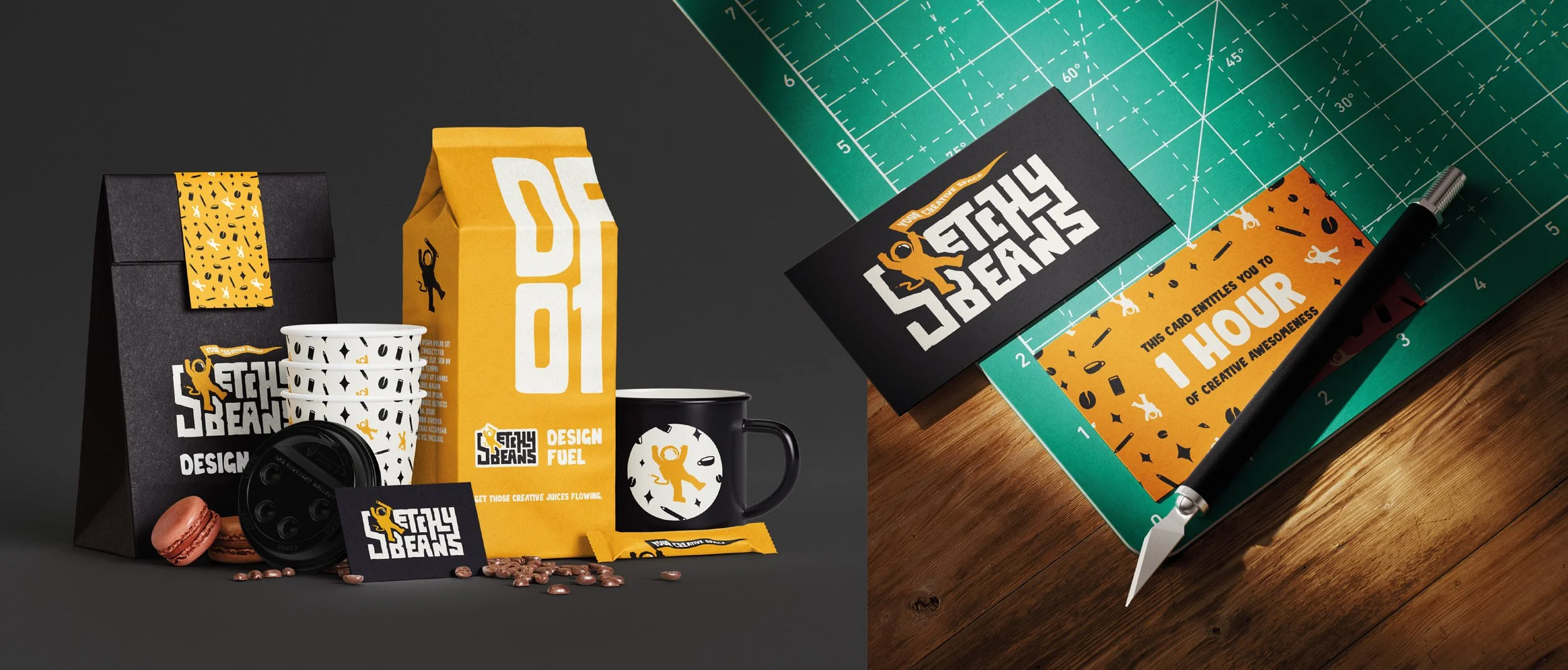
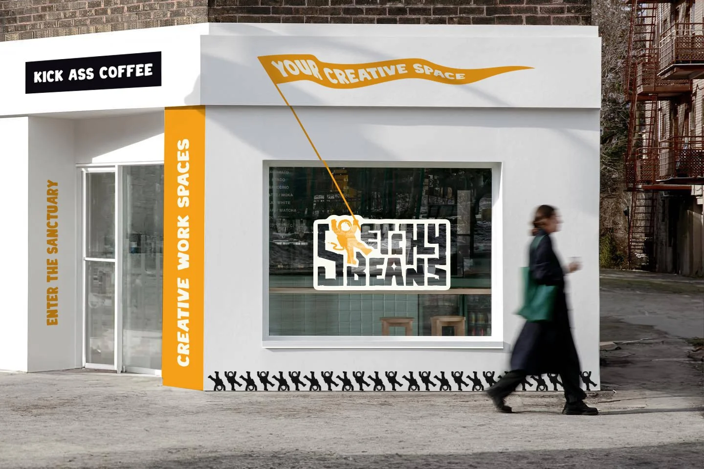
Sketchy Beans.
The creative co working space for creative people, that also serves essential design fuel, aka coffee. Sketchy beans offers a safe and creative co working space for creatives, whilst feeding their bodies with kick ass coffee. A space for deep, focused work with zero distractions. Aimed at freelancers, creatives and driven professionals.
This identity reflects the creative and fun nature of the brand by adopting a hand drawn technique which appears welcoming, approachable and edgy.


The Concept.
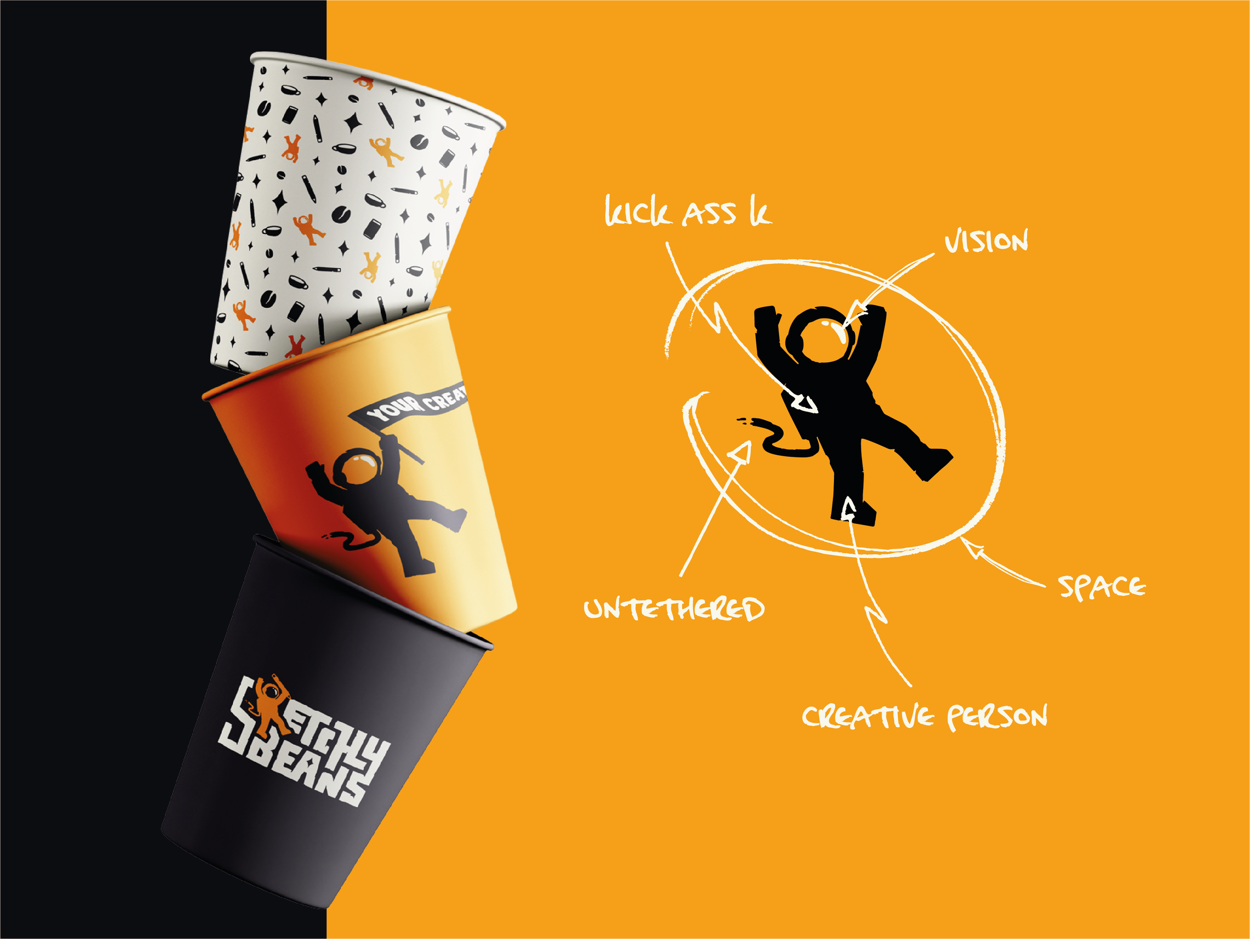
During wordmapping and throughout the brief, I noticed a trend with the use of the word ‘space’. Then I realised that outer space shared a lot of key characteristcs with the Sketchy Beans brand, such as:
Possibilities Stars Unique Environment Fuel Coffee Creation Quiet Peaceful Exploration Everyone Encompassing
Just like a rocket needs fuel to blast through outer space, we need fuel in the form of our dearly beloved coffee to blast through the design space.
The theme evolved through aliens and coffee bean rockets to astronauts. Symbolising creatives within the ‘space’ of their industry, untethered and broken free. Exploring and navigating the creative world, the suit as our safe space.
Typeface & Colour.
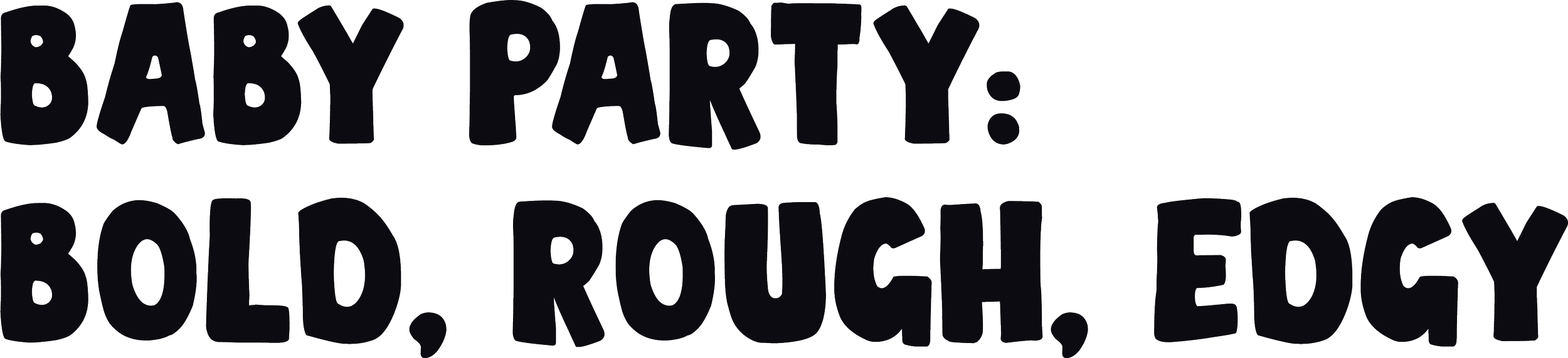
I knew the typeface had to reflect the hand drawn style of the logomark and convey a sense of imperfection.
Baby Party fits this category perfectly, it provides a unique, hand written typeface that pairs with the logomark fantastically.
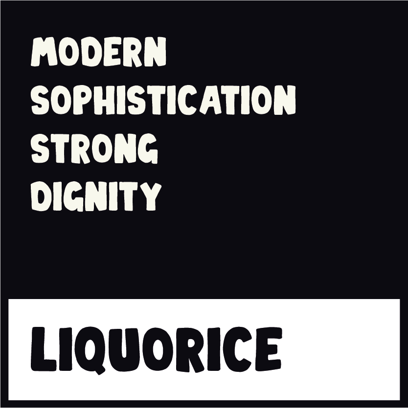
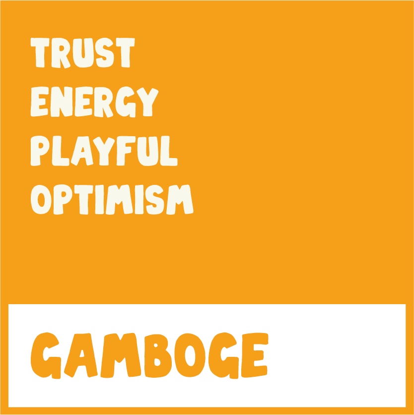
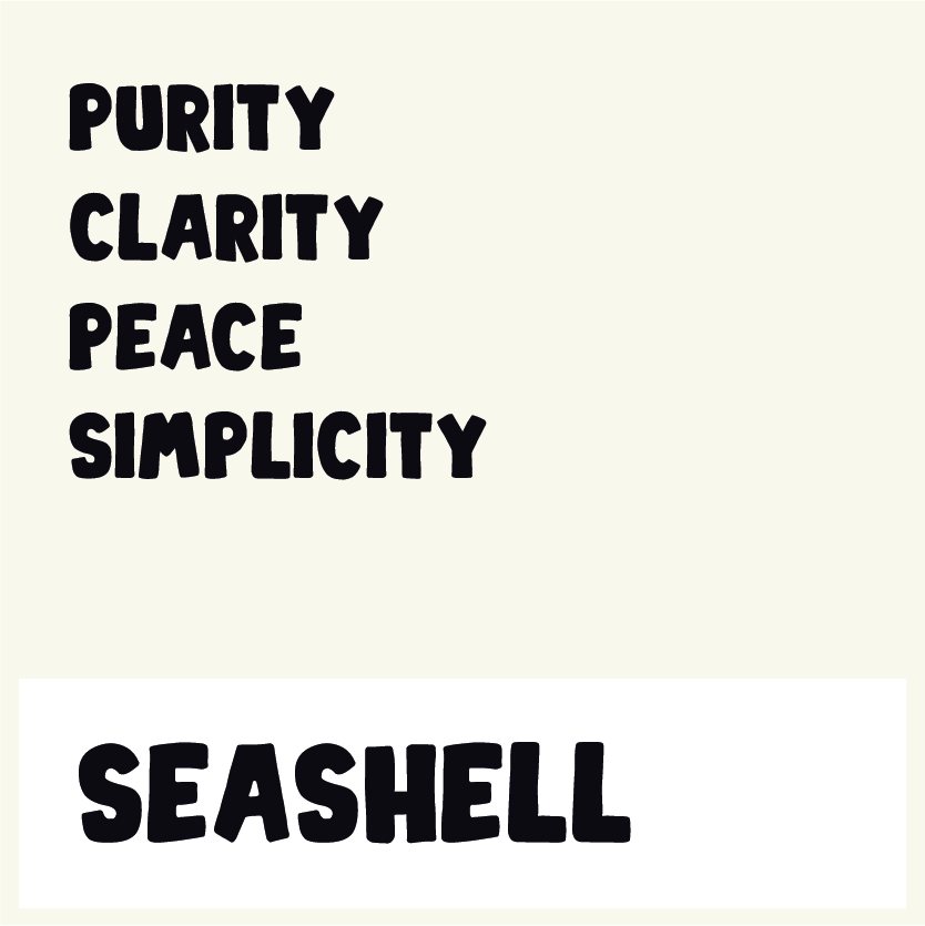
The colour palette was developed by using bold and bright colours that convey a sense of professionalism yet playfulness at the same time.
So with that in mind I came up with a visually striking palette that suits the company and it’s services down to the ground.


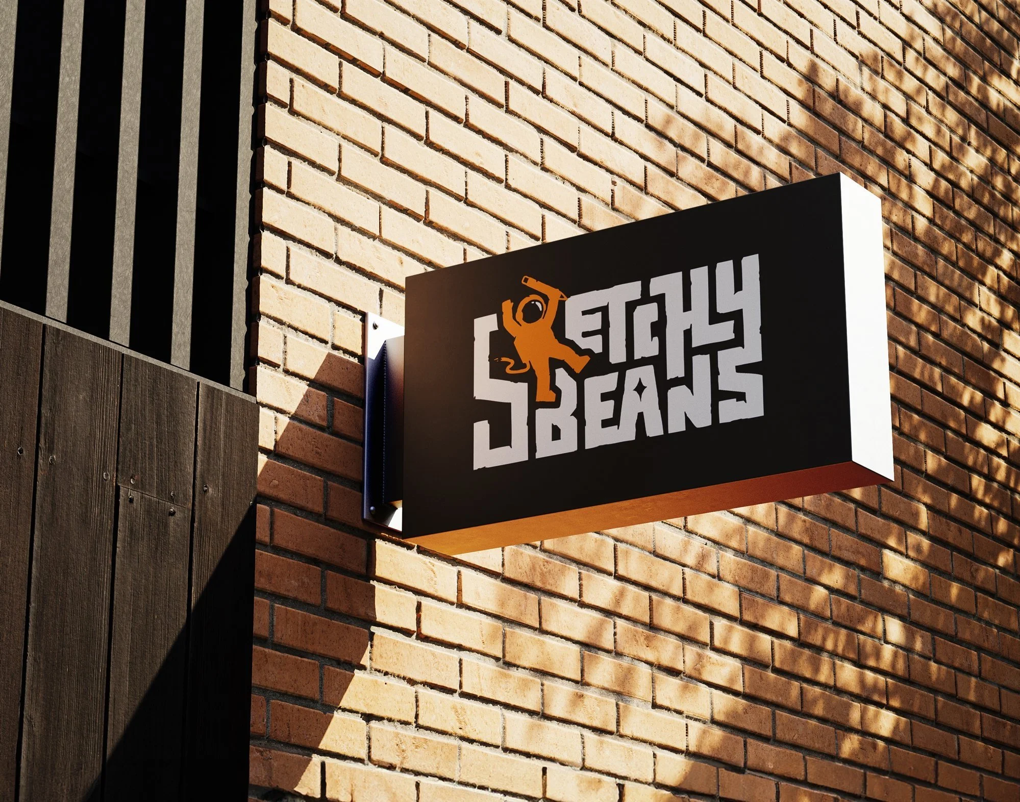
The end result.
A super unique, fun and creative logomark that will make Sketchy Beans stand out in the crowd and entice creative people.